What Is a Burndown Chart and How Do You Read One?
A beginner-friendly explanation of burndown charts, covering what they show, how to read the common patterns, the difference from burnup charts, how to create and maintain one, their genuine limits, and common mistakes.


A burndown chart is one of the simplest visualisations in agile and one of the most frequently misread. It has two lines and two axes, and the shape of the gap between the lines tells you something specific about how a sprint is going.
It also has real limitations, which matter because teams routinely draw conclusions from it that it cannot support.
This guide explains what it shows, how to read the common shapes, how it differs from a burnup chart, and what it cannot tell you.
Quick answer: Quick answer: A burndown chart shows how much work remains in a sprint or project over time. The vertical axis is remaining work, the horizontal axis is time, and a straight ideal line runs from the starting amount down to zero at the end. The actual line is plotted daily, and the gap between the two shows whether the team is ahead, behind or on track.
What a Burndown Chart Shows
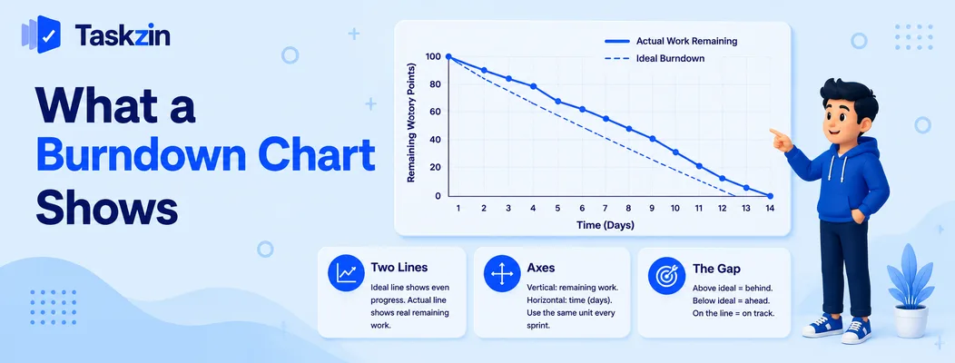
A burndown chart plots remaining work against time, with an ideal straight line to zero and an actual line updated as work completes — the gap between them is the message.
The two lines and what each means
The ideal line is a straight diagonal from the total work at the start down to zero on the last day.
It represents even progress and is a reference, not a target.
The actual line plots what genuinely remains, updated as items are completed. Above the ideal line means behind; below means ahead.
What the axes measure
The vertical axis is remaining work — story points, task count or hours, depending on what your team uses. The horizontal axis is time, usually days in the sprint.
The unit matters less than consistency. Whatever you choose, use it every sprint, because comparing charts across sprints is where most of the value sits.
Why it burns down rather than up
Measuring what remains rather than what is done keeps attention on the finish. A chart of completed work rises reassuringly even when the total has grown, which can look like progress while the end date moves away.
That said, this is also the burndown chart's main weakness, and it is why burnup charts exist — see below.
How to Read the Shape
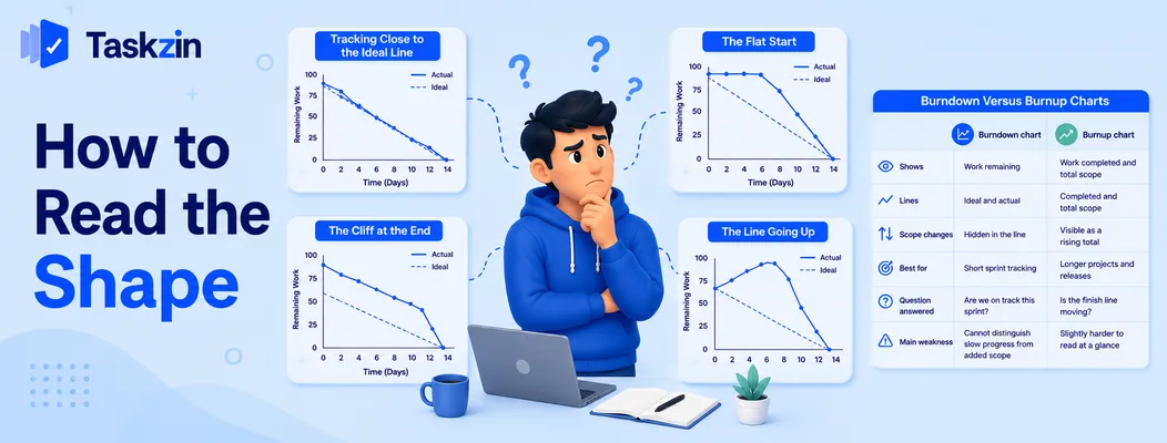
The shape tells you more than the position: a steady descent is healthy, a flat start indicates work is not being closed, a cliff at the end means everything finished at once, and a rising line means scope was added.
Tracking close to the ideal line
Roughly following the ideal line means work is being completed steadily throughout the sprint.
Note that suspiciously perfect tracking is worth a second look. Real sprints are lumpy, and a chart that matches the ideal exactly sometimes indicates the numbers are being managed rather than reported.
The flat start
The line stays flat for the first several days, then drops sharply. This is the most common pattern and it means work is being started but not finished.
Usually it indicates too many items in progress at once. Everything is 80 percent done on day six and nothing is closed. Limiting work in progress addresses it directly.
The cliff at the end
A steep drop on the final day or two means the team closed everything at the end. Sometimes that reflects genuinely large items completing together; more often it means status was not updated until the sprint review approached.
Either way the chart provided no early warning, which removes most of its purpose.
The line going up
Remaining work increased. This means scope was added mid-sprint, or existing items were re-estimated upward once the work was better understood.
This is not automatically wrong, but it should be visible and acknowledged. A sprint that quietly absorbs additional scope and then misses its goal has failed for a reason nobody recorded.
Burndown Versus Burnup Charts
How to Create a Burndown Chart

Shows Work remaining Work completed and total scope Lines Ideal and actual Completed and total scope Scope changes Hidden in the line Visible as a rising total Best for Short sprint tracking Longer projects and releases Question answered Are we on track this sprint? Is the finish line moving?
Main weakness Cannot distinguish slow progress from added scope Slightly harder to read at a glance
How to Create a Burndown Chart Choose a consistent unit, plot the ideal line from your starting total to zero, and update the actual line daily as items complete.
Decide what you are measuring
Story points, number of items, or hours. Points are most common in Scrum; item count works well for teams with similarly sized stories; hours are more granular and more effort to maintain.
Pick one and keep it. Switching units between sprints makes the historical comparison meaningless.
Plot the ideal line
Draw a straight line from your total at the start of the sprint to zero on the final day. This is a reference for even progress.
It is not a commitment to complete a fixed amount each day. Nobody works that evenly, and treating deviation from it as a problem produces exactly the status-management behaviour that makes the chart useless.
Update it daily
The chart's value comes from early warning, which requires daily updates. Most project tools generate it automatically from task status, which removes the maintenance entirely.
If you are maintaining it by hand and it is being updated twice a sprint, it is documentation rather than a tool, and it will not warn you about anything.
What a Burndown Chart Cannot Tell You
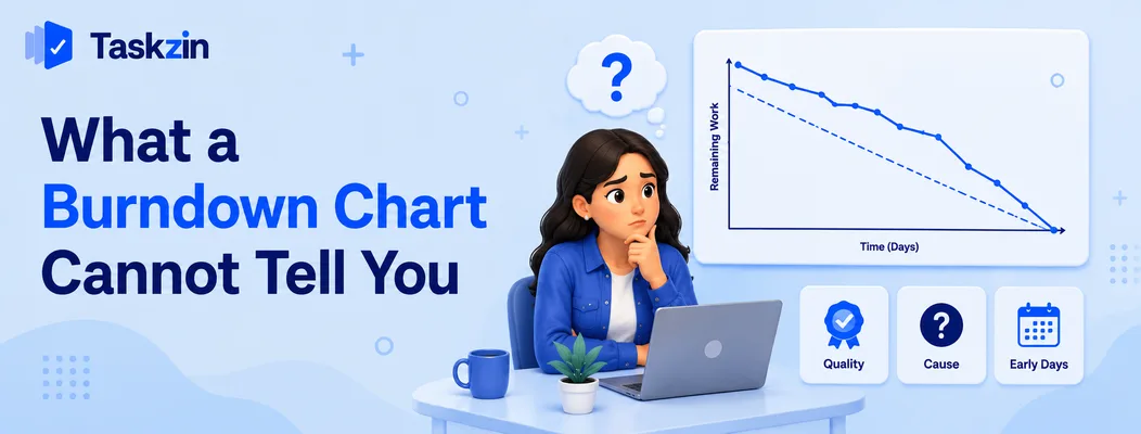
The chart shows quantity of remaining work and nothing else — not quality, not the cause of a delay, and nothing reliable in the sprint's first days.
Whether the work is any good
A sprint can burn down perfectly while producing work that fails review, carries defects, or misses the point.
The chart counts completion, and completion is defined by whatever your team calls done. If the definition of done is weak, a healthy chart means very little.
Why the line is where it is
A flat line tells you work is not closing. It does not tell you whether that is because someone is ill, a dependency is late, the estimate was wrong, or the team is blocked on a decision.
The chart is a prompt for a conversation, not a substitute for one.
Anything useful in the first two days
At the start of a sprint almost nothing is finished, so the actual line sits above the ideal by definition.
Reading this as being behind on day two is a common misinterpretation. The chart becomes informative around the midpoint, once enough has completed for the trend to mean something.
Common Burndown Chart Mistakes

The three errors that undermine burndown charts are using them to evaluate people, updating them only at the end, and drawing conclusions from a single sprint.
Using it as a performance measure
The moment a burndown chart is used to judge a team, the numbers stop being honest. Items get marked done early, estimates inflate, and the chart displays whatever produces an acceptable shape.
It is a self-diagnostic tool for the team. Used as a management report card, it stops working within a couple of sprints.
Only updating at the end
A chart updated on the last two days can only confirm what already happened. The entire value is early warning, which requires daily updates — ideally automatic.
Reading a single sprint in isolation
One sprint's chart is noisy. Illness, a holiday or one unusually large item distorts it.
The pattern across five or six sprints is where the information is. A team that flat-starts every single sprint has a work-in-progress problem; a team that did it once had a bad fortnight.
Frequently asked
What is a burndown chart?
A chart showing how much work remains over time, with an ideal straight line from the starting total down to zero and an actual line updated as work completes.
How do you read a burndown chart?
Compare the actual line to the ideal. Above means behind, below means ahead. The shape matters more than the position — a flat start indicates work is not being closed, and a rising line means scope was added.
What does it mean if the burndown line goes up?
Remaining work increased, because scope was added mid-sprint or items were re-estimated upward. It is not automatically wrong, but it should be acknowledged rather than absorbed silently.
What is the difference between a burndown and a burnup chart?
A burndown shows remaining work only, so added scope is hidden. A burnup shows completed work and total scope as separate lines, making scope changes visible — better for longer projects.
What should a burndown chart measure — hours or story points?
Either, provided you are consistent. Story points are most common in Scrum; item count suits teams with similarly sized stories; hours are more granular but more effort to maintain.
What does a flat burndown line mean?
Work is being started but not finished, usually because too many items are in progress simultaneously. Limiting work in progress is the standard remedy.
Is a burndown chart still useful for Kanban teams?
Less so. Kanban teams have no sprint boundary, so cumulative flow diagrams and cycle-time charts describe their work better than a burndown against a fixed period.
Binita Ray is a content writer at Taskzin, creating insightful and practical content on task management, team collaboration, productivity, workflow optimization, and SaaS solutions. She focuses on helping businesses, teams, and professionals simplify their work processes, improve efficiency, and make better use of modern productivity tools.
All posts by Binita Ray


Comments